Python, R, Qt, peewee, bokeh, pandas, SQLite plus couple of sleepless nights and here you are a cute app for the environmental monitoring needs )))
 |
| Main window of the application |
Ph.D. (Geography), senior researcher, environmentalist.
Expert in environmental safety, land monitoring and land management,GIS implementation. Experienced project manager with strong leader skills.
GIS-fan, volunteer in environmental and community oriented projects.
Interested in environmental researches all over the world.
+' "Профиль автора в Science Index")


Python, R, Qt, peewee, bokeh, pandas, SQLite plus couple of sleepless nights and here you are a cute app for the environmental monitoring needs )))
|
| Main window of the application |
This was one of discussion questions of the Disasters and Ecosystems MOOC.
Actually the answer is simple. The formula for successful environmental degradation consists of 2 variables – overpopulation and capitalism.
When there are a lot of people – most of them a poor, uneducated and hungry. When you are hungry you will do everything to become less hungry today even if it can potentially lead to negative consequences tomorrow, which you may not even foresee if you are uneducated.
Humans are good in adaptation. When the adaptation is strong enough it leads to abuse (for example, if you are well adopted at the stock market you start abusing it to increase your profit even if it will cost dearly to the other stakeholders – people value their own well-being much more than the other’s and of course much more than the well-being of environment especially when they know that their own impact seems negligible compared to impact of the entire population). When you live in condition of free market of capitalistic world – you are your only hope for not being hungry (or being more wealthy) now. And as you know from the economic theory – the capitalist economy needs a constant grows of consumption and production – so you need more and more resources to just sustain the economy. In conditions of capitalist market people value today’s profit much more than losses of tomorrow
You see – the capitalist economy needs people to consume more and more; more people – more consumption; more people – more poverty and lack of education; more hungry uneducated people people – more people willing to do anything to survive now and don’t even bother themselves about the future.
Overpopulation and a consumption society (created by capitalist economy) inter-stimulate each other and destroy the environment for the today’s profits or food and doesn’t care much of the consequences of tomorrow because most are either uneducated or doesn’t care at all plus you have to live through today to face consequences of your actions tomorrow (a day-by-day living).
Obviously there are 3 steps to improve the situation:
It is amusing coincidence that another MOOC that I took this week (Geospatial Intelligence & the Geospatial revolution) mentioned [natural] disasters. About the other course see my recent Disasters: Myth or the Reality post.
In Geospatial Intelligence they gave a weird assignment: one need to mark the location on the world map where the next international natural disaster will occur O_o. This is not and easy task by any means and the lecturer suggested to use one’s ‘gut feeling’ if one’s knowledge is insufficient (I suppose it is close to impossible to find someone who can make such a prediction taking into account all the types of the disasters). Though the link to the International Disasters Database was given, so I accepted the challenge (to make a data-driven prediction). To predict the exact location of the next disaster one would need a lot of data – far more that you can get out of that database so my goal was to make prediction at the country level. (BTW the graphs from my post about disasters seems to be based on the data from this database – I saw one of them at that site)
I passed a query to the database and saved the output to process it with R. The dataframe looks like this:
 |
| Example of disasters dataset |
So how to predict the country with the next disaster? I came up with the idea to calculate cumulative average occurrence of disasters per country per year and plot it on the graph to see the trends. If I would just calculate average occurrence of disasters per country for the whole time of the observations I would have significant issues choosing from countries that would have close numbers. Plus the total average disasters per year can be misleading by itself due to it can be high because of high amount of disasters in the beginning of XX century but relatively low number in XXI.
The formula for the calculation of the cumulative average for the given year that I used was:
Cumulative_Average = Total_Occurences / ( Given_Year – (Starting_Year – 1) ) ,
where: Total_Occurrences is the sum of occurrences of disasters for given country in time interval between the starting year and the given year (inclusive).
Here is the plot I got for the short-list countries (plotting the results for all the 180 countries from the dataset makes plot unreadable):
 |
| Cumulative average number of disasters |
It is clear that China and Indonesia are the two most likely candidates for the next disaster to strike, with a China having a lead. I’m not ready to provide insight on the reasons of the increasing number of natural disasters in the countries at the plot now (especially for Turkey and Iran). Maybe it is just that the events become documented more often?… It should be investigated further.
Here is the code to create the plot above. ‘sqldf’ package was really helpful for divide data for the short list countries from the rest of 180 countries.
library(ggplot2)
library(sqldf)
library(grid)
#library(gridExtra)
# Load natural disasters data ---------------------------------------------

dis <- read.csv("~/R/Disasters/Natural_disasters.csv")

# Create data frame with average number of disasters per year -------------

average_events <- data.frame(country = character(),
year = numeric(),
disasters_per_year = numeric(),
stringsAsFactors = F)

countries <- unique(dis$country)

starting_year <- min(dis$year) - 1 # we subtract 1 year to have numbers greater than 0 further on

for (country in countries) {
data <- dis[dis$country == country,] # we need data for one country at a time
disasters_count <- 0
years <- unique(data$year)

for (year in years) {
total_years <- year - starting_year
y_data <- data[data$year == year,]
n_disasters <- sum(y_data$occurrence)
disasters_count <- disasters_count + n_disasters
average_disasters <- disasters_count / total_years
row <- data.frame(country = country, year = year, disasters_per_year = average_disasters)
average_events <- rbind(average_events, row)
}

}
# Plot data about average number of disasters per country per year --------
# Data for 180 countries is hard to plot, lets filter mots affected.
# Let's use SQL to query data: subset data for countries that had more than 0.6 disasters per year
# in any year after 2000
danger <- sqldf('SELECT * FROM average_events WHERE country IN
(SELECT DISTINCT country FROM average_events WHERE disasters_per_year >= 0.6 AND year > 2000)')

p <- ggplot(danger, aes (x = year, y = disasters_per_year)) +
geom_line(size = 1.2, aes(colour = country, linetype = country)) +
labs(title = 'Cumulative average number of disasters per year',
x = 'Year',
y = 'Average number of disasters cumulative') +
guides(guide_legend(keywidth = 3, keyheight = 1)) +
theme(axis.text.x = element_text(angle=0, hjust = NULL),
axis.title = element_text(face = 'bold', size = 14),
title = element_text(face = 'bold', size = 16),
legend.position = 'right',
legend.title = element_blank(),
legend.text = element_text(size = 12),
legend.key.width = unit(1.5, 'cm'),
legend.key.height = unit(1, 'cm'))

plot(p)
I enrolled a MOOC titled “Disasters and Ecosystems: Resilience in a Changing Climate” which is organised by the UNEP (and other organisations… which names I’m going to learn by heart cause they have like 2 minutes of credits after each lecture ![]() ). Not that I know nothing about disasters, risks or climate change (I’m a geographer and ecologist after all), but I was curious about the product that was made by organisation of this class.
). Not that I know nothing about disasters, risks or climate change (I’m a geographer and ecologist after all), but I was curious about the product that was made by organisation of this class.
The third video (and first video that is not an introduction) they teach us about the disasters; differences between hazard and disaster; and risks. Well… the thing they told, the graphs they showed – that what inspired the title of this post.
Disaster. When they say “disaster” they mean “natural disaster” that was enhanced by human [mismanagement].
Risk – a potential losses due to disasters.
Hazard – A dangerous phenomenon, substance, human activity or condition that may cause loss of life, injury or other health impacts, property damage, loss of livelihoods and services, social and economic disruption, or environmental damage.
Vulnerability – the characteristics and circumstances of a community, system or asset that make it susceptible to the damaging effects of a hazard

 |
| Deaths dynamics |
 |
| Damage dynamics |
I quickly came up with an idea of creating interactive plot for my simple model for assessment of the profitable ratio between the volume waste that could be illegally disposed and costs of illegal disposal [Ryabov Y. (2013) Rationale of mechanisms for the land protection from illegal dumping (an example from the St.-Petersburg and Leningrad region). Regional Researches. №1 (39), p. 49-56]. The conditions for profitable illegal dumping can be describes as follows:

Here: k – the probability of being fined for illegal disposal of waste;
P – maximum fine for illegal disposal of waste (illegal dumping);
V – volume of waste to be [illegally] disposed by the waste owner;
E – costs of illegal disposal of waste per unit;
T – official tax for waste disposal per unit.The conditions for the profitable landfilling can be described as follows:

Here: V1 – total volume of waste that is supposed to be disposed at illegal landfill;
Tc – tax for disposal of waste at illegal landfill per unit;
P1 – maximum fine for illegal landfilling;
E1 – expenditures of the illegal landfill owner for disposal of waste per unit.
Lets plot the graphs (with some random numbers (except for fines) for a nice looking representation) to have a clue how it looks like.

Note that there is a footnote (this post provides nice examples on how to do it) with the values used for plotting – it is important to have to have this kind of indication if we want to create a series of plots.
Now I will show you the result and then will provide the code and some tips.
 |
| Playing with the plot |
Before I will show you code I want to share my hardly earned knowledge about nuances of the manipulate library. There are several ways to get static plot like that using ggplot, but some of them will fail to be interactive with manipulate.
<pre class="brush: r; title: ; notranslate" title="">library(ggplot2)
library(grid)
library(gridExtra)
library(manipulate)
library(scales)
library(reshape2)

## Ta --- official tax for waste utilisation per tonne or cubic metre.
## k --- probability of getting fined for illegal dumping the waste owner (0
There is a quite interesting article about the corruption level in EU countries was published at BBC recentely. Of course the map is the most interesting part.
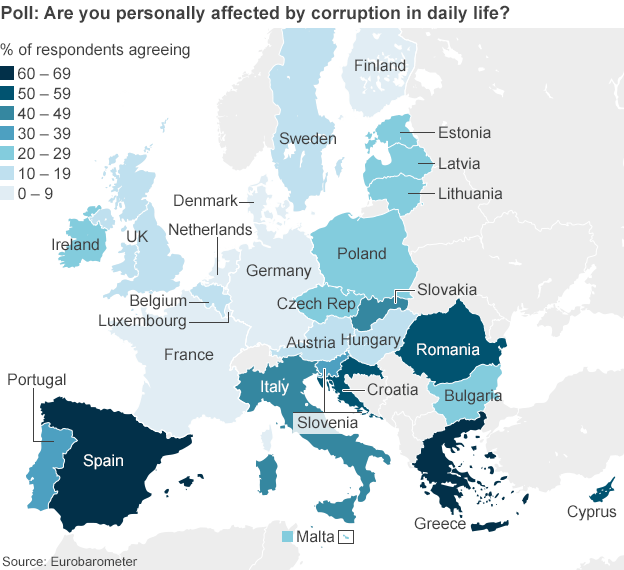
The thing that I totally noticed in the very first moment of observing it is that the countries with the highest corruption level have the lowest credit ratings (see this map).

When will all these bastards understand that corruption hurts everyone?
Today I received a copy of proceedings of the conference I participated in. A peculiar moment is that my article about using Random Forest algorithm for the illegal dumping sites forecast is the very first article of my section (as well as of the whole book) and it was placed regardless of the alphabetical order of the family names of the authors (this order is correct for all other authors in all sections).
My presentation and speech were remarkable indeed – the director of my scientific-research centre later called it “the speech of guru” (actually, not a “guru”, there is just no suitable equivalent in English for the word used). Also the extended version of this article for one of the journals of the Russian Academy of Sciences received an extremely positive feedback from the reviewers. So I suppose the position of my article is truly some kind of respect for the research and presentation and not a random editorial mistake.
Now I should overcome procrastination and make a post (or most likely two) about this research of mine.

By the way I was able to assess probability of being caught for illegal dumping in Russia. It is about 10-5 (you can die while playing soccer with such probability).
The only way to reduce waste fares is to use waste as a resource. That means that the only way to prevent illegal dumping is to create waste management system that would be able to complete the zero waste goal.
And here is an abstract from my article:
Mechanisms of the land protection were discussed in this article. An algorithm of decision making whether to dump illegally or not was explained. Formulas for determination of profitable ration of expenditures per unit and amount of illegally dumping waste are substantiated. Effect from different types of impacts that can be used for land protection from illegal dumping were discussed (such as fares change, penalties change, penalty application probability change). Decreasing of waste disposal fares was acknowledged as the most effective way for illegal dumping prevention, but it is possible only if «zero waste» concept is implemented.
Nowadays more and more people cares about environmental-friendly goods. Ecolabeling is often used to distinguish such goods from regular goods.
But there are several issues:
So I would like to propose another approach. Do you remember BP re-branding after Deepwater Horizon explosion and infamous oil spill? I hope you do. What if we will oblige companies to put negative labels on the products which production causes significant threat to environment?! – A universal “eco-Black-Spot” for environment abusers!
Pros:
Cons:
And what about design of the eco-Black-Spot? I believe it will be convenient to use something like this:
![]()
or this:

There was a scientific seminar dedicated to environmental risks assessment in the scientific-research centre where I work. A speaker was awfully ignorant in subject unfortunately. As a person who is experienced in environmental risk assessment (see my posts about risks and a particular methodology) I was afraid that I will be the one to ask the speaker (quite an old man) some inconvenient question about formulas he used, but luckily he was ashamed by someone else.
During the discussion the question of monetary aspect of the risk and damage to environment was raised: whether it is possible to use money as the measure of risks that only applicable to environment itself. In other words: is it rational to use money when assessing possible damage to solely ecosystem (there are no money in ecosystem by itself), and how to perform such assessment?
What do YOU think? I wasn’t able to find an appropriate answer at that moment, but now I believe I have a point. My answer is YES, we can use money to assess risks and damage dealt to ecosystem only.
Firstly the assessment is made by humans and for humans. And humans understand monetised value more easily. The approach that I want to propose is about assessment of money that have to be spent to recover ecosystem to exact the same state it was prior to caused or possible damage. Just imagine how much money one have to spent for recreating and reintroduction of just one extinguished species (a tasmanian wolf for example). Here you are a monetised damage to environment.
Another approach I have in mind is about evaluation of risks via relative live value of species (which can be easily monetised too). Lets use this formula for evaluation of life of individual of a given species: V=(1/N)*P, where V – relative value, N – population of the given species (or given areal of species), P – total population of the human beings. We will have a relative value as 1 for humans and 1*(P/N) for a given species. For example for a tiger we will have its relative individual value about 1 076 900! Literally, if we have a choice whether to save 1 million people or a single tiger, the tiger must be saved – not a million of people!!!
And we can monetise this value by multiplication on the average value of the single human life (you can play a bit with numbers given here).
So the damage to ecosystem may be assessed via loss of number of individuals of species that live in a given ecosystem and we are able to easily evaluate a relative value of the individuals of the each species, and it can be easyly monetised.

